I led UX and IxD efforts of HMHONE Core Team. Core Team was responsible for the foundation of the whole application hense the name "Core". All architectural, structural, visual and functional rules have been set by this team. HMHONE was spread between New York, Boston, Orlando, Dublin, Prague, Warsaw and Mumbai.
"Natalie O’Rourke has proved to be a
highly trusted design partner in a cross functional team environment. She was engaged in the development
and construction of a next generation platform experience which will serve U.S. teachers, students and
parents – the numbers of which are in the millions. It’s a rich and complex project that requires a high level
of strategic thinking along with excellent prototyping skills and a strong UX knowledge base. Natalie brought
creativity and technical professionalism to the project every day, she was a pleasure to work with."
Thomas Haugh,
Director of Operations in Design Architecture
HMH Studios: Design
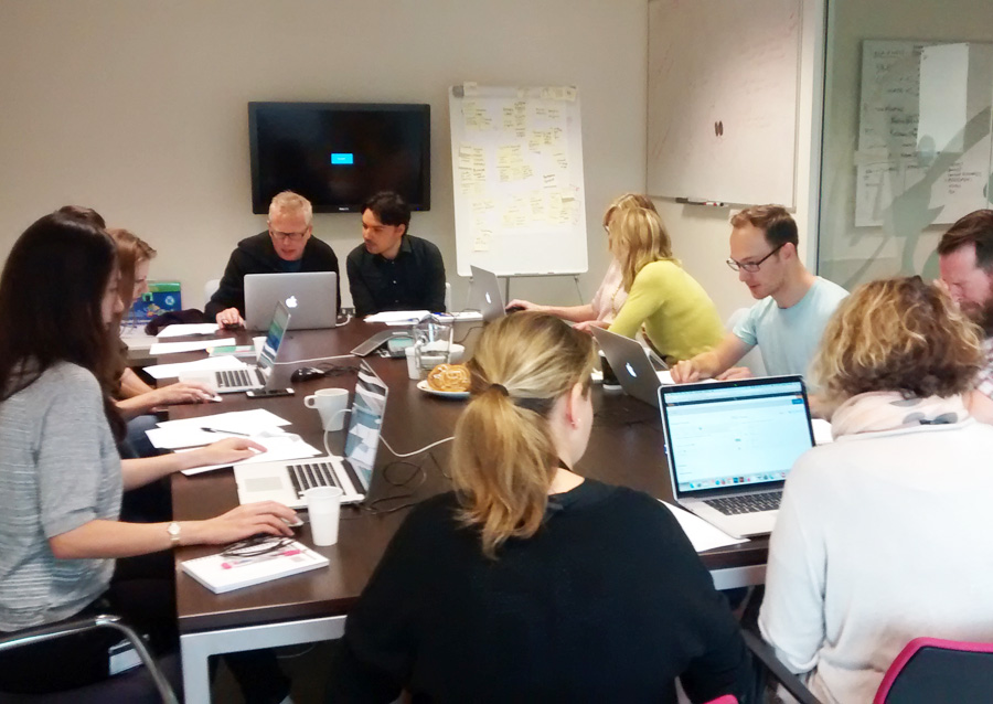
I was the only UX designer in Core team. Overall we had 7 designers who were responsible for different areas of the application, from assessments and assignments to reports and school management. It was a diverse and talented group of people. We worked closely together to create something extra-ordinary: a smart, robust school management system which would simplify every day life for millions of teachers, students and school management across the United States of America.
The project was running for about 8 months before I joined in. A lot of great work was put in place, the main foundation and directional goals have been set, the structure of the application has been already developed. It was pretty challenging for me to get up to speed with 8 months of meetings and agreements between management, designers and developers. However, after about 30 days I was flying through tasks and leading UX work of the Core team.
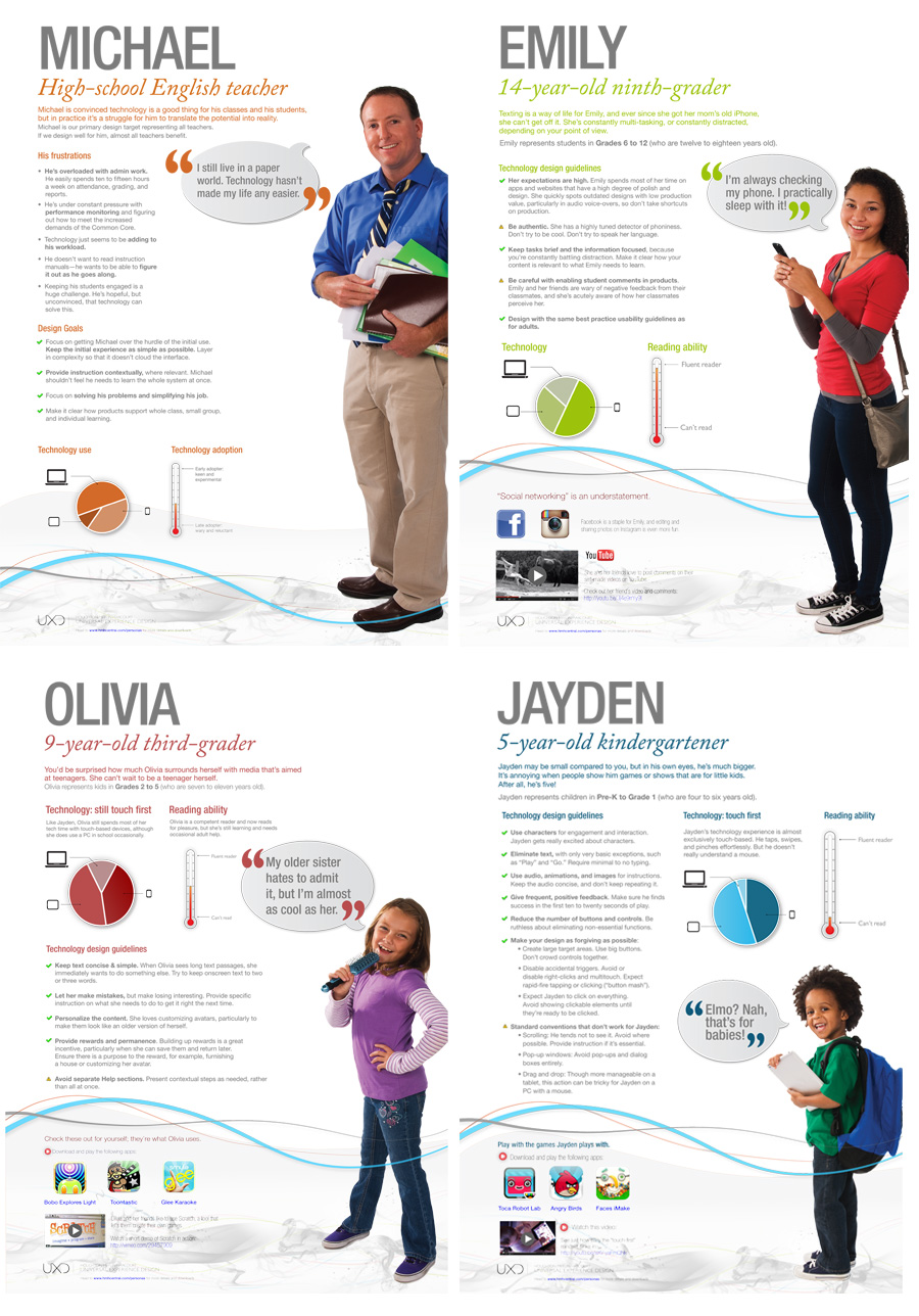
I am especially proud of bringing the importance of end-user needs and goals back to the picture, developing true personas and facilitating user testing sessions. Out of 7 designers we had in our team, 5 were junior UX designers. My focus was to guide them and encourage the empathy for the end-user of our application. In fact, I started referring to students, teachers and school management as that, not as end-users. It helped all of us to stay in focus and solve real problems for real people by being true designers and creating beautiful and meaningful features. As they say "art is self-expression, design is problem solving".
My greatest achievement in this role was a successful completion of Alfa-release version of the software. It received glowing reviews from the Board of Directors and stakeholders.
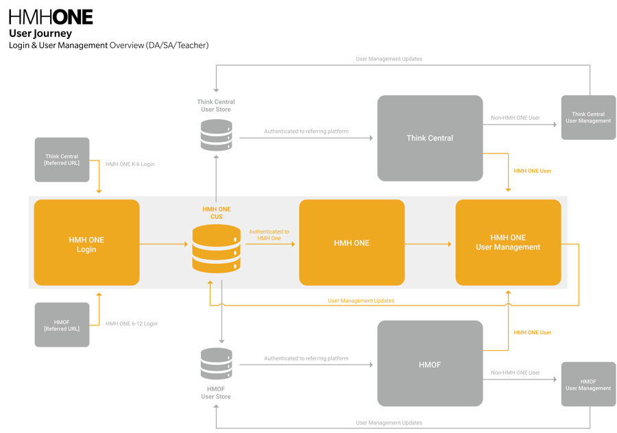
HMHOne was designed to combine and replace a few existing applications. The biggest challenges were multiple login areas and inconsistent user interfaces. All existing portals had different URLs, login details and look and feel. Existing applications were also lacking a number of modern functional aspects that were expected on the market place.
We conducted research and analysis. From user surveys and staff interviews, usage analytics and market feedback, participating in online message boards and analysing existing applications and their functional aspects. I gained enough information to start creating solutions to the existing challenges.
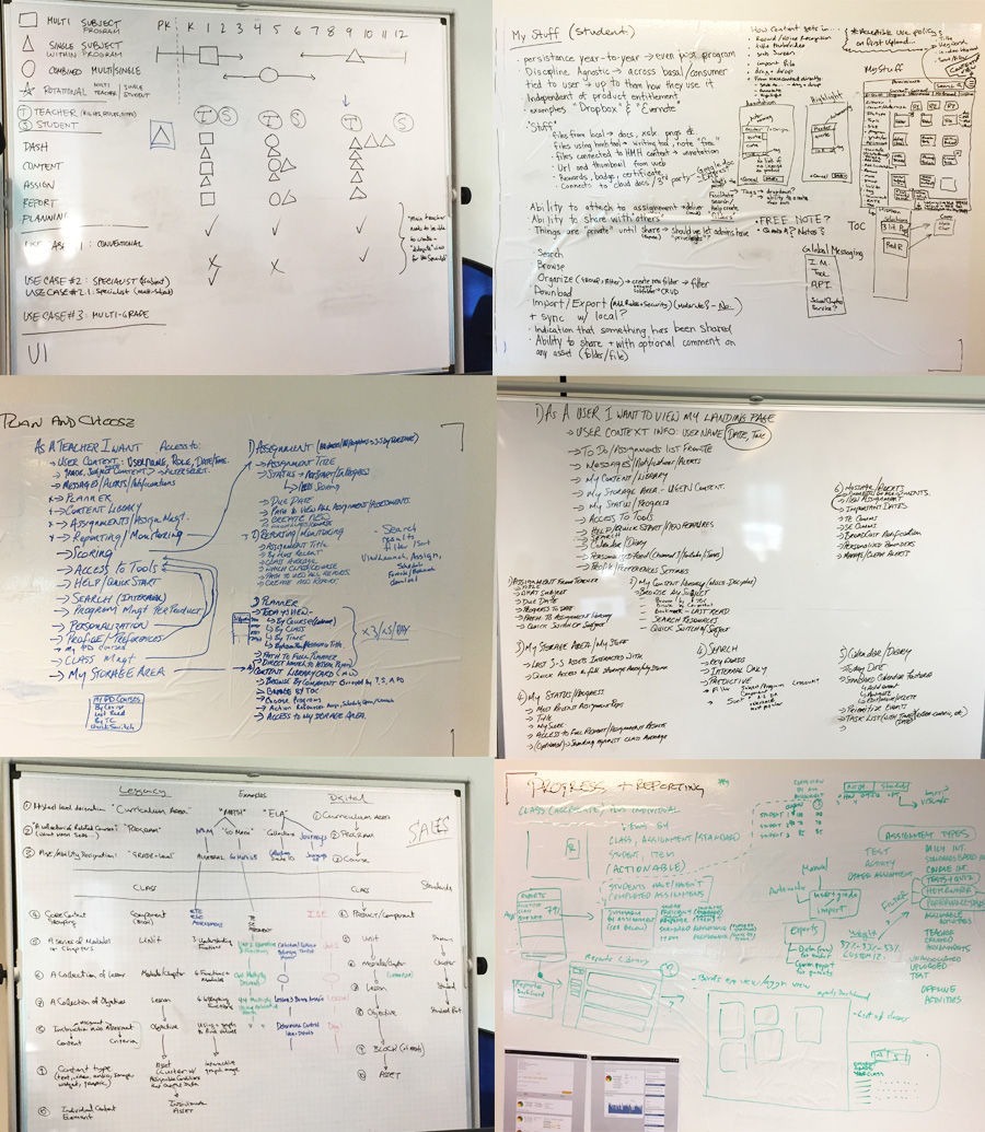
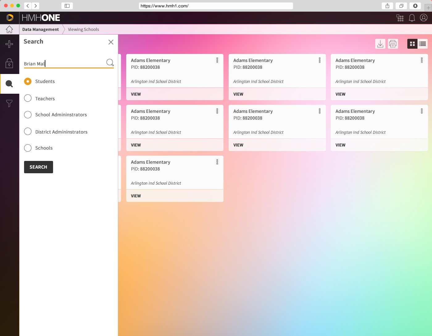
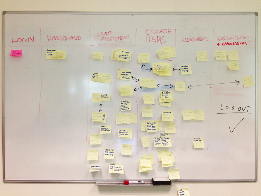
Based on the user personas we've identified, we divided information into logical sets based on different type of user accesses. This would allow us to filter and display only what was important to that type of the user. It significantly increased the number of items on dashboards, leaving space for the most important content. Top level users were internal - CITI staff, external - CITI clients and portal admin - CITI admins. Each of them would have sub-user and multi-user views and features. On top of that, each user would have an additional tier functionality, ranging from 1-5 tier users. I've created a number of wireframes to explain to our Board of Directors and developers how it will all function together.
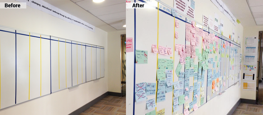
Because of the size and the range of locations of our teams, we had to create wireframes and prototypes for each aspect of new functionality. It was much easier to explain the flow and micro-interactions when a working prototype is in place.
We wanted HMHONE experience to feel light, cheerful, human, professional, and friendly. We felt it should to be similar to HMH corporate branding but different in a way that it would appear more modern and funky. We also had to come up with different UI for younger users. White-label options for resellers were also a part of the agenda.
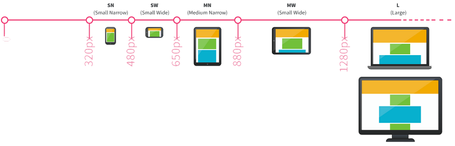
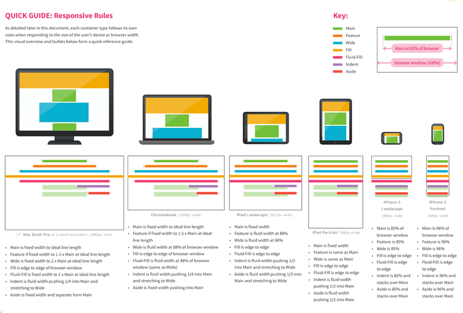
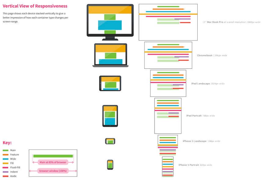
We covered the traditional UI Stack with 5 states of design: Ideal, Error, Partial, Loading and Blank State. All of them had to be responsive and work on desktop as well as on mobile devices.
We conducted our first user testing in-house. We asked HMH staff who was not exposed to our application before to perform a few tasks in our application. The feedback was positive however a few unclear functional aspects have been discovered. We documented our findings and put a plan in place to rectify them one- by one.
For our next user testing we hired 4 teachers in various state in the US. They've been asked to complete a number of tasks they would normally do at work. Here is a list of some of them, create an assignment and assessment, generate a report, add and delete students to a class. The sessions were followed by user interviews where our teachers/testers had a chance to highlight any possible issues they came across while completing their tasks. The overall feedback was good. They liked the interface and the idea that all tasks can be done online and all information was saved into an archive relevant to each student, teacher and activity. A few minor challenges were discovered but overall, our application was ready for the Alpha release to our stakeholders.
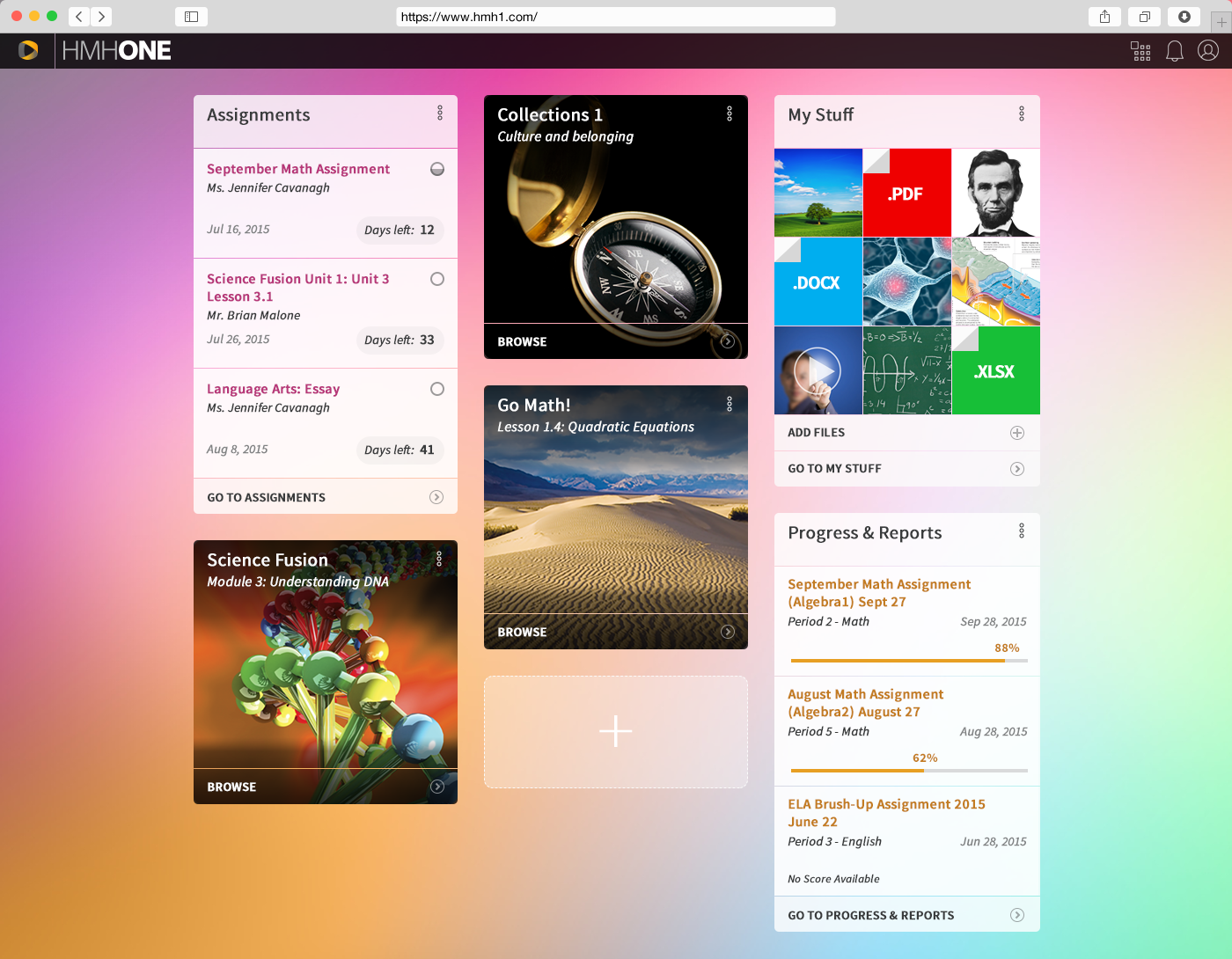
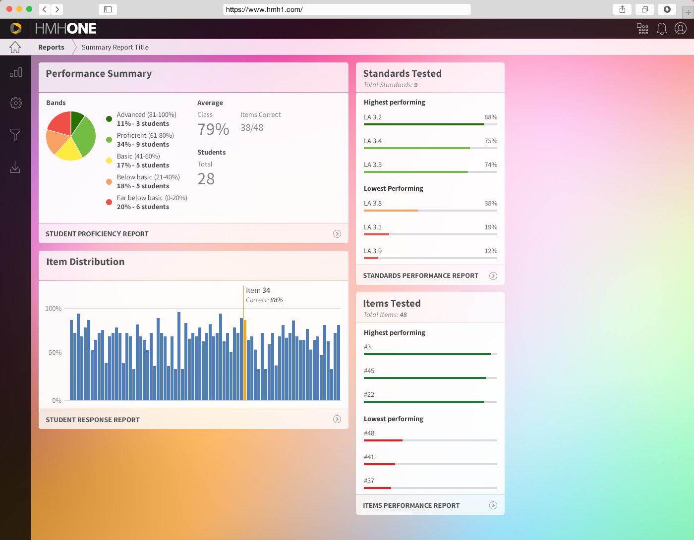
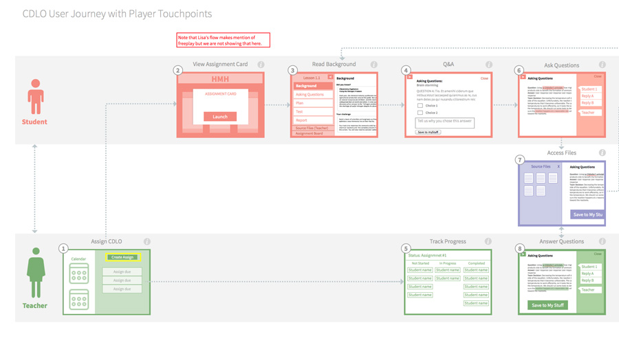
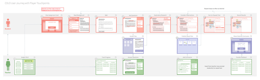
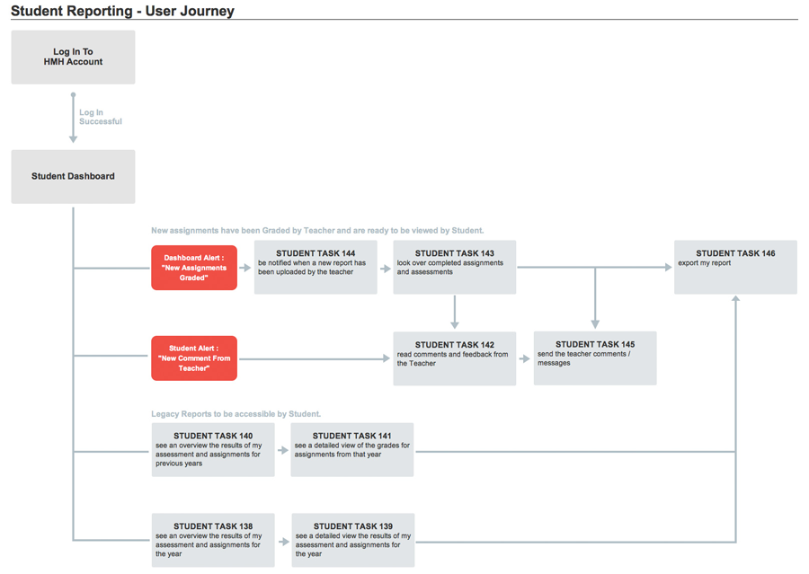
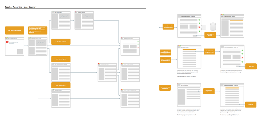
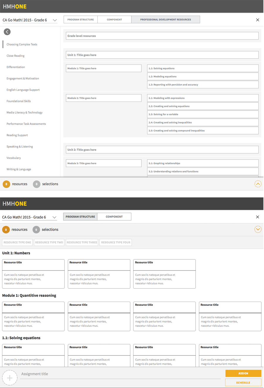
The vision was to create the most visual and user friendly school management platform known to the EdTech. Below are my favourite visuals proposed by our design team.