I led Product Design efforts across iOS, Android, Desktop and Smart Watch Devices, working within a team spread between New York, London, Hong-Kong, Pune and Dublin.
"Natalie is a highly experienced CX professional. In her time in Citi she added immediate value in her contributions and leadership to our next generation client experience platforms. Natalie's work accentuated a robust technical platform with a well considered multi-persona user experience based on crisp and clean visuals.
Natalie is someone who appreciates and delivers elegant and concise solutions. In keeping with that ethos I would simply recommend Natalie in the highest terms for leadership positions in user experience and design."
Robert Mooney,
Executive Director
CITI Investment Analytics
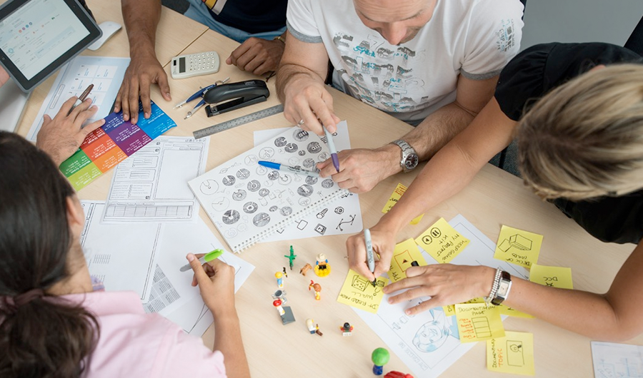
Initially I was the only designer in our team. UX, UI and Information Architecture Design were my daily responsibilities. From user research, persona development, staff interviews, user journeys to wireframes and completed polished designs for all operating systems listed above. Every day was filled with enormous amount of creative work and astounding progress. Within the first a few weeks I completed a set of highly detailed wireframes. These wireframes were a majour part of our presentation to the Board of Directors, while reporting on the progress of Clarity.
It can be extremely difficult to get a full engagement of all members of senoir management team while presenting a new concept. Quiet often it would generate a discussion with pro's and con's thrown in the air. In our case, the wireframes were very clear and easy to follow which resulted in not only obtaining full attention but even compliments from the group of executives. The meeting proved very successful but it was only the beginning for us. Now we had to go back and start designing data visualisations, software interface and functionality of our application.
We were challenged with a new mile stone, where within 3 months we have to present a fully operational version of software to the same Board of Directors. No code has been written until now, no database was set up, no data ready. 3 months is a very tight deadline for such a
massively complex project. However almost anything is possible when you have a team of highly dedicated focused professionals.
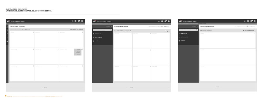
Clarity was designed to replace and improve a few older pieces of software that have been in operation for many years. Most of CITI staff had a chance to work with some or all of them, especially those in CITI Investment Analytics around the globe.
Existing applications were lacking a number of modern functional aspects that were expected in today’s market place. As an example, to generate a report customer had to use multiple login details to gain access to different parts of the same database. We suggested combining all information into one portal, logically separating content based on the type of the access. Another issue was that a number of tasks were processed manually which was quiet time consuming. In our estimations, Clarity would save CITI around $40 million dollars per year. We were inspired by this number and worked hard and smart for months to come.
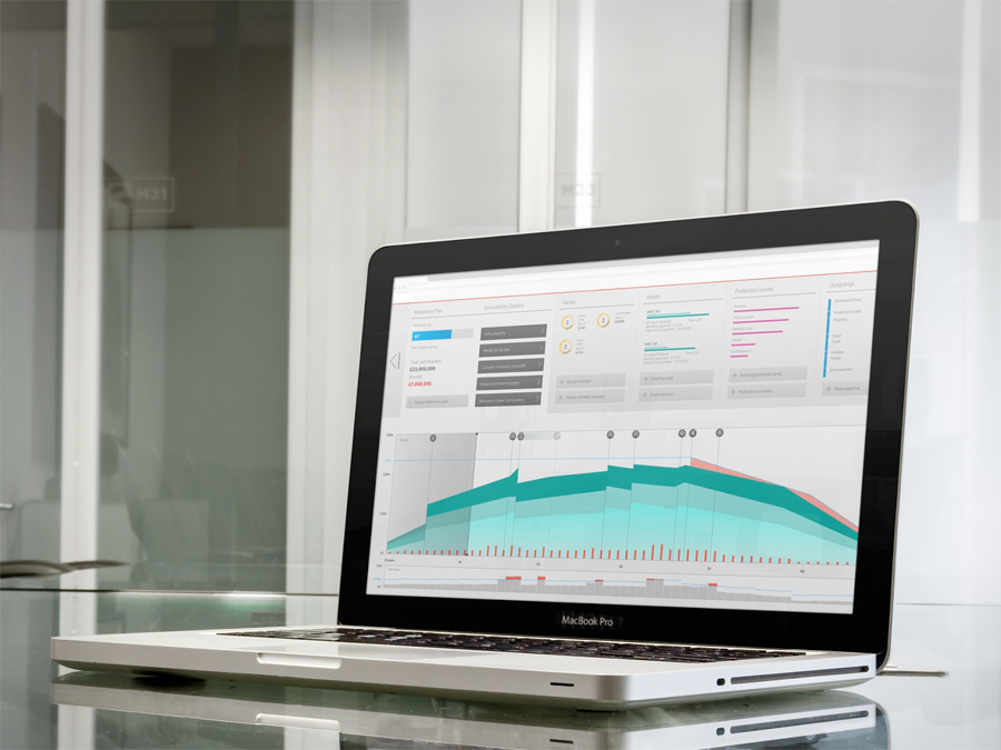
Considerable research and analysis of existing applications, usage analytics, market feedback, user surveys and staff interviews were completed. They led us to a conclusion that by combining all required information into a logical dashboard like environment would be the best way forward. We've decided to use brand new innovative technology allowing us to supply all information in our dashboards not from achieved data as previously but from live data where our customer could manipulate and monitor live changes in their online portfolios.

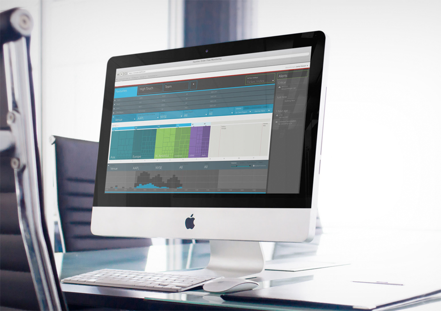
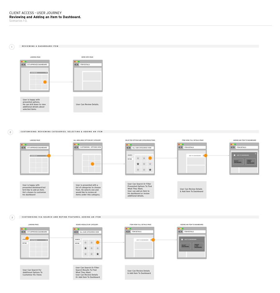
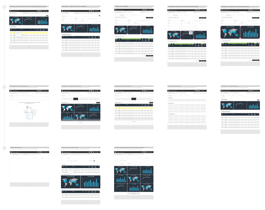
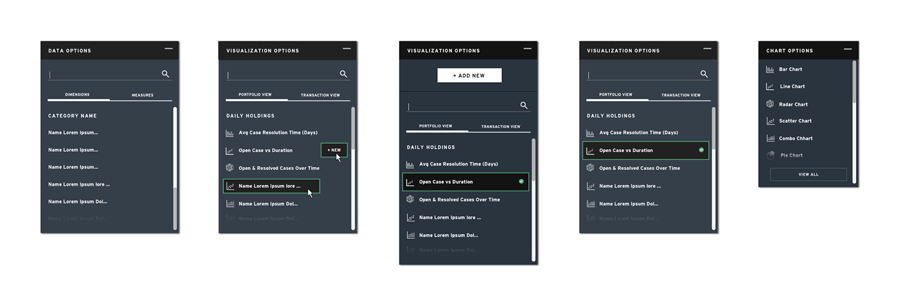
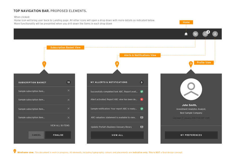
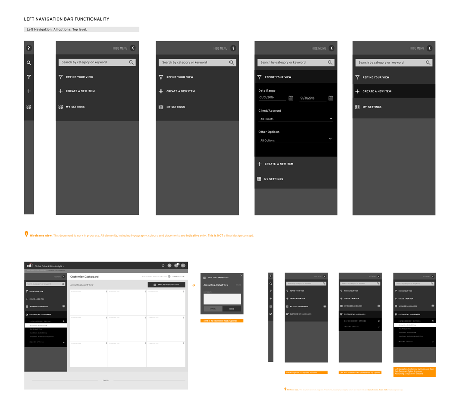
Based on the user personas we've identified, we divided information into logical sets based on different type of user accesses. This would allow us to filter and display only what was important to that type of the user. It significantly increased the number of items on dashboards, leaving space for the most important content. Top level users were internal - CITI staff, external - CITI clients and portal admin - CITI admins. Each of them would have sub-user and multi-user views and features. On top of that, each user would have an additional tier functionality, ranging from 1-5 tier users. I've created a number of wireframes to explain to our Board of Directors and developers how it will all function together.
Within the first couple of weeks I have completed a set of highly detailed wireframes. They looked very simple however they accommodated each and every tier user, sub-user and multi-user views. Remembering I was the only designer at that time, I worked relentlessly but the rewards were huge too. Our presentation to Board of Directors was a glowing success. They agreed to increase funding allocation as well as been congratulatedvia email newsletters and personally. It increased my confidence as this experience involved every aspect of my profession.

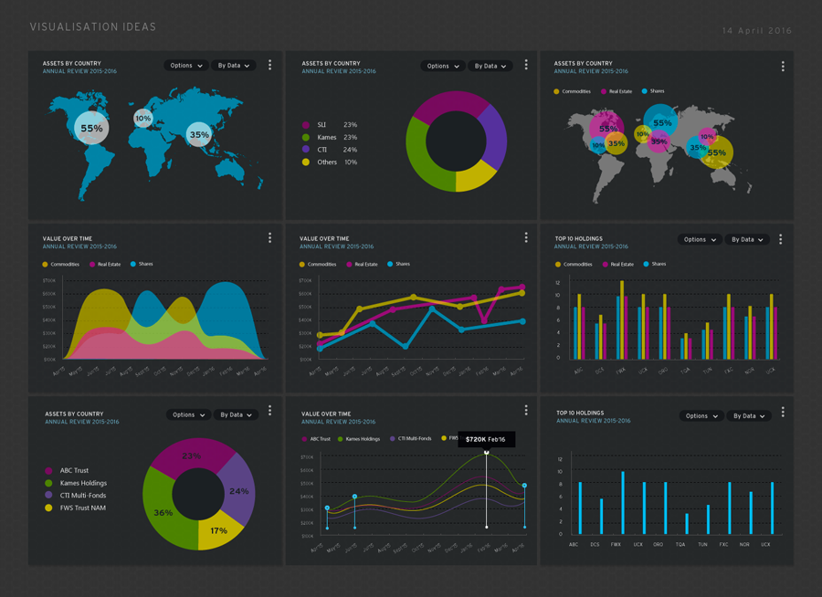
The initial idea was to create a new sub-brand differentiating from traditional CITI's branding colours: blue, white and red. We wanted the experience to feel luxurious, trustworthy, human, professional, and friendly.
Slick charcoal and black shades with semi transparent gradable cards containing striking colours of data visualisations were used in first drafts of designs. The words like graphite, carbon, black sapphire and charcoal were used a lot.
The UI Stack has been divided into 5 sets of designs. Ideal state, Error State, Partial State, Loading State and Blank State. Ideal State represents a "perfect" case scenario, a fully loaded page. Error state covers all possible variations of what can go wrong with the a particular page. For example, some data is completely or partially missing, we had to have the UI for each and every scenarios.
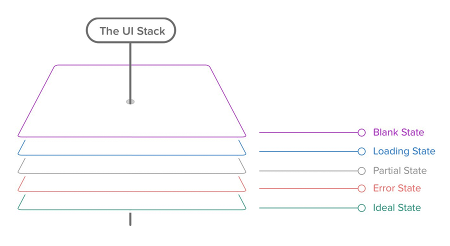
Based on the identified 5 UI States, I have designed interactions and behaviors for each element in each scenario. From simple buttons to calendars, menus, modals and data visualisations, it was a massive task but it was also a fun exercise.
The very first user testing was performed in-house. We engaged CITI staff to test our application from start to finish. The feedback was both encouraging and positive. The Users loved the simplicity of the interface and the ease of use. Our live data manipulation wasreceived with amazement giving the “cutting edge” we were striving for.
The vision was to create the most comprehensive and easy to use Investment Analytics Portal. It would include slick UI, smart UX and innovative live data manipulation technology to support it on the back end.
"A dream written down with a date becomes a goal. A goal broken down into steps becomes a plan. A plan backed by action makes your dreams come true."– Greg S. Reid